How I built this web site - part 2.1
By JF Poilprêt
IMPORTANT NOTE: Initially I planned Part 2 “Advanced Customization & Improvements” to fit in just one post, but it turns out it would be much too long, hence I decided to split this part 2 into 4 subparts:
- Part 2.1: Customization Approaches (the current post)
- Part 2.2: Improvements in my blog
- Part 2.3: Integrating Almeida-CV Theme
- Part 2.4: Tools, Tips & Tricks
Introduction
This is the second post of the series that describe my experience with Hugo to create this web site:
- Part 1: Fundamentals & Practice
- Part 2.1: Customization Approaches (the current post)
- Part 2.2: Improvements in my blog
- Part 2.3: Integrating Almeida-CV Theme
- Part 2.4: Tools, Tips & Tricks, Next steps
- Part 3: Deployment
In order to customize my own blog site, I had to:
- learn more about Hugo customization (layout templates, markdown render hooks, short code)
- find a way to integrate my Résumé (with another Hugo theme)
- learn about Ananke theme customization (CSS with Tachyons “library”) and Almeida theme Résumé generation (CSS and specific fonts)
- find out Hugo tips and tricks which I collected during my site creation
This 2nd post is dedicated to advanced customization with Hugo and Ananke theme, it focuses on explaining the various ways one can use to customize their site.
Practical application of those methods for my blog will be provided in the third post.
Various ways to customize
Hugo in general, and Ananke in particular, offer several ways to customize their behavior to your wishes.
Most ways complement each other, so you’ll finally end up using many (or all) according to each customization you want to implement for your site.
In this post, I will list, by order of increasing complexity, the various approaches to customization, along with situations where some approaches can apply to.
According to what you want to do to improve your site, it is advised to:
- have a good understanding of HTML
- understand what CSS is and how it works (but no need to master all gory details)
- know basic usage of your web browser “debugger” mode (very useful for CSS customization); for me this is FireFox, the only browser I use. Here, the main interest of a debugger is to find out the style applied to an element in a web page and possibly change the style dynamically to “live check” how it renders.
I find the following tutorials quite good and I often refer to them whenever I need (because I don’t know HTML and CSS by heart and that’s OK, as long as I know where to look for what I need):
- W3Schools HTML Tutorial
- W3Schools CSS Tutorial
- MDN Web Docs CSS: official Mozilla documentation for developers, very rich and well written
Basic Configuration
Hugo and many Hugo themes, like Ananke, support a lot of configuration through usual hugo.yaml file.
That is probably the easiest way to customize a web site!
Configuration may enable you to:
- change some colors used by the theme
- change some theme styles (through CSS classes)
- change theme simple behavior (e.g. list of social networks to share to, or follow for your account; number of posts summaries per page; dates format…)
Each theme generally describes all its configuration options for you to modify easily. For Ananke, you can find useful information here and there.
In addition, some attributes in posts front matter can contribute to visual improvements:
menu: tells if and where this page shall be added to the contextual menu; note there are several ways to handle Hugo contextual menu and I prefer another way, which I’ll describe in the 3rd post.toc(table of contents): tells if a Table of Contents should appear for a given post (very useful for long posts)
Archetypes
This is a Hugo concept, it allows you to “pre-define” models for some of your posts.
An archetype looks like a post (Markdown format, along with front-matter metadata section) but it is located in your Hugo project archetypes/ folder, and is named according to the section for which new posts shall use it as a model. It may also contain some Hugo “functions” to “calculate” a metadata attribute when creating a post.
For instance, Ananke default archetype contains the following content:
---
title: "{{ replace .File.ContentBaseName "-" " " | title }}"
date: {{ .Date }}
tags: []
featured_image: ""
description: ""
---
In this sample, what is embedded between {{ / }} pairs is Hugo code that offers you a lot of possibilities. In Ananke default archetype above:
title: uses the content file name, replaces hyphens with spaces and capitalizes itdate: is initialized with current date (and time) when the post was created
Creating your own archetypes will not change the look or behavior of your web site, but that will make you more efficient in writing posts for which you always want certain content or metadata pre-setup.
Generally, themes provide a default archetype e.g. in themes/ananke/archetypes/default.md which will be used if no other archetype is defined in your project.
In your Hugo project, you may:
- override default archetype in
archetypes/default.md, that will take precedence over the theme’s default archetype - create an archetype for posts in a given section
my-sectionunderarchetypes/my-section.md, it will be used when creating a new post withincontent/my-section/
Layout Templates
Templates are probably the most powerful way with Hugo to customize your web site; however, it is also more complex than other possibilities; this is because there is some level of “programming” involved in there.
Simply stated, Hugo templates are text files (mostly in HTML format but not necessarily) that are used as models to generate pages in your site.
Each theme comes with a set of templates that implement the theme style and layout. They are stored in themes/<theme-name>/layouts directory and its subdirectories.
You may override any of the existing templates by:
- creating your own template file, with the same name as the overridden one
- and putting it in your own Hugo project
layouts/while keeping the subdirectory structure
Hugo will automatically use your template instead of the theme’s one.
In Hugo, there are various template types to cover various situations, and the list is increased according to the theme you use. For Hugo and Ananke, we have the following types of templates (paths below start from within theme’s layouts subdirectory):
/_default/baseof.htmlskeleton for ALL generated HTML pages, contains all parts of the HTML file according to HTML specs (<html>,<head>,<body>tags with prefilled content) and some named blocks which will be replaced by content from other templates; in particular, “main” block is dynamically replaced according to the type of generated page. All other pages in your site are implicitly based on that template./index.htmlthe template for the home page of your site/404.htmldefault page appearing when trying to open a page that does not exist in your site/_default/*.htmlall distinct “main” blocks, used inbaseof.htmltemplate:list.htmlandsingle.html(Hugo standard concepts), and other “big” parts of such main blocks likesummary.html…/partials/*.htmlbuilding bricks, used bybaseof.html, for headers, footers, menus… These can be individually overridden to change any specific part. Among these, the following are particularly useful:site-header.htmldefines header part (title, menu, site image) for all pages in the generated site, except for blog post pagessite-footer.htmldefines footer for all pagespage-header.htmldefines header part for all blog post pagessite-navigation.htmldefines navigation part (used within header) with the list of available sections in your sitei18n.htmldefines part with a language selector, showing available site languagesmenu-contextual.htmldefines right sidebar section (with table of content, related links) within post pageshead-additions.htmlallows adding special stuff within<html><head>tags e.g. special fonts or JavaScript libraries
/partials/func/*.htmlincludes “functions” often used by the theme, e.g.GetFeaturedImage.htmlthat is used by Ananke to find and prepare the “featured image” for a blog post
Typically, you just have to override only one template file to improve one aspect of your web site, as we will see in the next post.
Note that there are 2 additional layout subdirectories I did not mention, they are described in their own sections below:
/_default/_markup/render-*-html/shortcodes/*.html
In practice, you may end up overriding a lot of templates if you added a lot of improvements for your site:
Templates I have overridden for my blog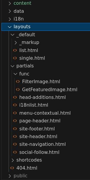
The following Hugo documentation is useful to understand more about about templates:
- Introduction to templating
- Template types describes all Hugo types of templates, but note that some types may not be used by themes like Ananke (and replaced with their own template types)
- Template Actions describes the possible actions in templates (embedded between
{{and}}) - Template lookup order Hugo is powerful and allows template overriding according to many criteria; this page describes how templates are looked up to determine exactly which template file to use to render a given page or page part
Custom CSS
Ananke theme is entirely based on Tachyons CSS for HTML styling.
Most CSS classes used in HTML tags within Ananke-provided layout templates are classes provided by Tachyons.
Often when you want to improve style for your web site, using Ananke theme, you will have to:
- understand how Tachyons classes impact style in rendered HTML
- know which Tachyons classes you should remove, change or add to get the style you want
- understand how Tachyons concepts deal with different device area sizes and affect rendering
First off, one has to understand Tachyons main principle for its classes: “mobile comes first”, which means that all provided CSS classes come in several flavours:
- base class: e.g.
fw4, meaningfont-weight:400 - namespaced classes:
fw3-ns,fw2-m,fw1-l, providing different font weight depending on actual device screen size (details below)
Without going into unnecessary CSS details, we can say that Tachyons defines 4 distinct breakpoints to get “responsive design” (style changes dynamically, based on browser’s window size). Simply stated, a breakpoint is a specific screen width where an HTML page’s layout changes to maintain best user experience.
Here are Tachyons breakpoints:
- default (base class): supports all screen sizes, but is optimized for mobile (small area size) experience
-ns(not small): for a minimum window width of “30em”-m(medium): for a window width between “30em” and “60em”-l(large): for a window width larger than “60em”
Note that in “30em”, em is a size measurement unit, in HTML, matching the base font size for the browser (generally 16 pixels), hence 30em is most often 480 pixels. Why not specify pixels instead? Because users may zoom in their browser’s window, which might impact this effect.
Defining a style on a given HTML tag will typically consist in:
- assigning a base class to it
- optionally adding specific classes from one or more (3 maximum) specific breakpoints, which will override base class behavior when window size is matching the breakpoint defined size condition
Here is an example, excerpted from Ananke theme /_default/list.html and simplified a bit:
 1  <article class="pa3 pa4-ns nested-copy-line-height">
 2    <section class="cf ph3 ph5-l pv3 pv4-l f4 tc-l center measure-wide lh-copy">
 3      {{- .Content -}}
 4    </section>
 5    <section class="flex-ns flex-wrap justify-around mt5">
 6      {{ range .Paginator.Pages }}
 7        <div class="relative w-100 w-30-l mb4 bg-white">
 8          {{ .Render "summary" }}
 9        </div>
10      {{ end }}
11    </section>
12  </article>
This template is used to display a page with a list of posts summaries.
- Specific breakpoint classes are used in lines:
- 1
class="pa3 pa4-ns" pa3(padding with medium spacing) is used for smallest devices,pa4(padding with large spacing) is used for all other devices- 2
class="ph3 ph5-l pv3 pv4-l tc-l" ph3(horizontal padding with medium spacing) is used for all but large devicesph5(horizontal padding with extra large spacing) is used for large devicespv3(vertical padding with medium spacing) is used for all but large devicespv4(vertical padding with large spacing) is used for large devicestc(text center aligned) is used for large devices, default text alignment (left) is used for all other devices- 5
class="flex-ns flex-wrap" flex(CSS flexible box layout) is applied to all but smallest devices;flex-wrapis effective only whenflexis active, it thus has no impact on smallest devices- on larger devices, with
flexandflex-wrap, posts summaries will be displayed on several columns according to available width, while on smallest devices, all post summaries will be displayed within one single column - 7
class="w-100 w-30-l" w-100(100% width used by post summary) affects all but largest devicesw-30(30% width used by post summary, thus limiting display to 3 columns) affects largest devices
Mastering Tachyons CSS classes is difficult, documentation is not easy for beginners and requires to have good background in CSS, that is why styling improvements may require several trial attempts until success.
In addition to changing Tachyons classes in layout templates, you may also define your own CSS classes when using Ananke theme.
For that you shall:
- Create your own CSS file e.g.
my_style.csswith all your specific CSS class definitions - Put this file inside
assets/ananke/cssdirectory in your Hugo project (create it first) - Tell Ananke to use your CSS file within your
hugo.yamlconfiguration file
params:
  ...
  custom_css: ["my_style.css"]
Then you can use any of your added classes, in layout templates you shall override.
With this approach, not only can you define additional CSS classes for your specific needs, but you may also override behavior of classes already defined by Ananke theme. You can find these Ananke-defined CSS classes within themes/ananke/assets/ananke/css directory.
The following links provide useful documentation and explanation about Tachyons:
- Tachyons - Style Guide quickly shows most base CSS classes provided with rendering example
- Tachyons - Components is a very nice showcase of what you can get with Tachyons and how you can get it (with HTML excerpts and related Tachyons CSS classes definition details)
- Tachyons - Docs is a table of content to categories of styles provided by Tachyons, each category links to more details and explanations; this can be useful as a way to learn CSS and Tachyons at the same time, but the list is quite tedious.
- Tachyons - Table of Styles is an exhaustive list of all Tachyons CSS classes, with their actual CSS definition; I often refer to it whenever I encounter an unknown CSS class and need to understand what it does. Do note that effective use of this reference requires good CSS knowledge.
Markdown Rendering
Hugo Markdown rendering engine is overridable (to some extent) so you can improve how some Markdown elements get rendered throughout your web site.
Markdown elements for which rendering can be customized are:
- Headings: rendered with HTML tags
<h1>,<h2>,<h3>,<h4>,<h5>&<h6> - Images: rendered with HTML tag
<img>or<figure> - Links: rendered with HTML tag
<a> - Tables: rendered with HTML tags
<table>(and its embedded tags:<thead>,<tbody>,<tr>,<th>&<td>) - Block quotes: rendered with
<blockquote> - Code blocks: rendered with HTML tag
<pre>and special utilities provided by Chroma
For each of these, you may provide one “render hook” which looks like a Hugo layout template and shall be located in your Hugo project layouts/_default/_markup directory:
render-heading.htmlrender-image.htmlrender-link.htmlrender-table.htmlrender-blockquote.htmlrender-codeblock.html
Please note that in most situations, default renderers provided by Hugo are just fine, but in some rare occasions, you may need to improve them.
Render hooks may not just be used for “rendering” but also for specific processing, e.g. for images that you may want to compress or resize.
Some render hooks can be complex to write, this is why it is advised not to write them from scratch, but start from Hugo-provided default renderers, available from Hugo source code or in Hugo Render Hooks documentation.
Writing a render hook requires good understanding of Hugo templates and actions, i.e. programming.
As you will see in next post, I have overridden only a few render hooks for my blog.
Shortcode
As per Hugo documentation, “shortcodes are simple snippets inside your content files calling built-in or custom templates”.
Concretely, shortcodes:
- allow you to extend your markdown content
- by performing specific rendering
This could be seen as “macros” or more simply, “functions” that you write as Hugo templates, and call from your markdown content.
Shortcodes may come from:
- Hugo itself (see example below): these embedded shortcodes are listed here
- The theme you use (e.g. Ananke provides a shortcode to use in a contact form page): those are located in
themes/<theme-name>/layouts/shortcodesdirectory - Yourself! With Hugo, you can create your own shortcodes; those shall be located within your project
layouts/shortcodesdirectory
As a concrete example, Hugo provides a youtube shortcode you can use from one content page to embed a YouTube hosted video. The following example shows how it can be called from your content Markdown:
{{< youtube id=04jt39xxdkk start=105 end=150 >}}
This shortcode sample will embed the following Youtube video (shameless plug: this is a video of me demonstrating a small electronic game I made):
Specific shortcodes may also be useful when you have a series of similar posts that follow a certain structure and needs special computation or rendering that standard Markdown does not provide. This will be further demonstrated in next post.
Next Post
The next post (part 2.2) will demonstrate practical use of all enumerated means above, to customize a Hugo web site with Ananke theme, applied to my own blog.
The following improvements will be described:
- Section pages
- Headings
- Site Footer
- Site Headers
- Hike posts
- Hikes summary post
- Hamburger menu & internationalization
- Sidebar
- Image rendering & compression